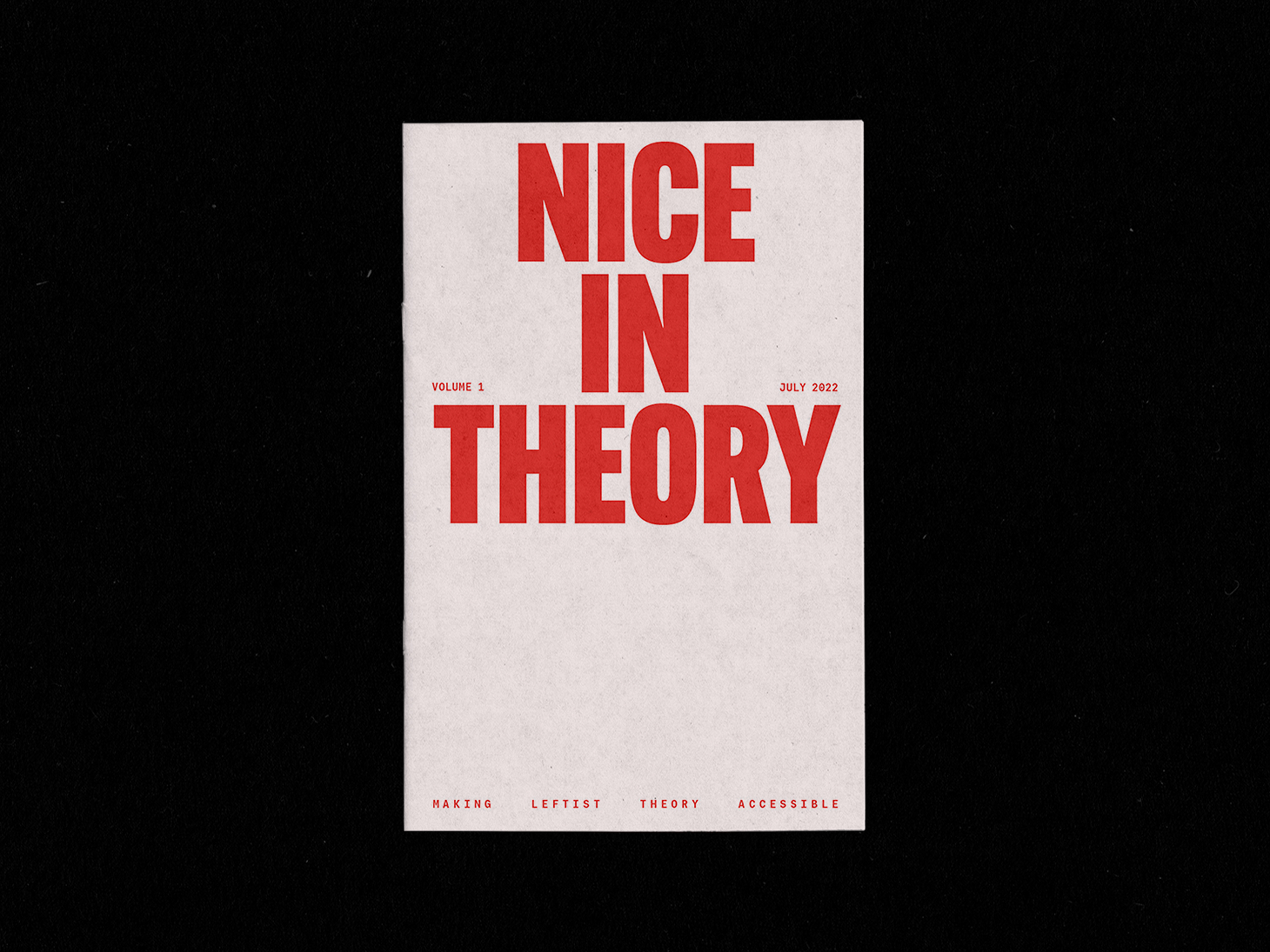
Nice in Theory
Demystifying Political Dialogue.
Overview
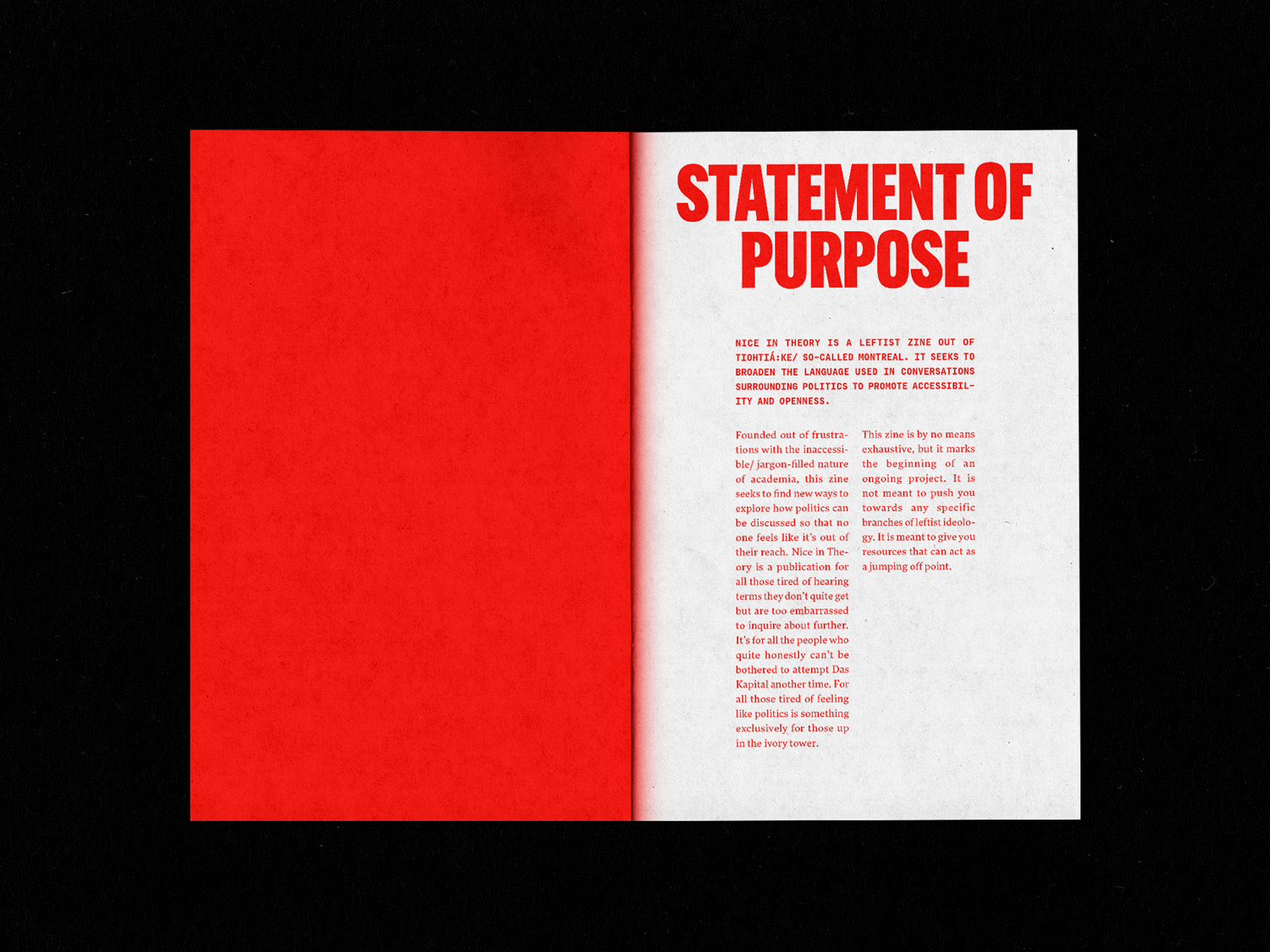
Nice in Theory is a leftist zine out of Tiohtiá:ke/ so-called Montreal. It seeks to broaden the language used in conversations surrounding politics to promote accessibility and openness.
Founded out of frustrations with the inaccessible/ jargon-filled nature of academia, this zine seeks to find new ways to explore how politics can be discussed so that no one feels like it’s out of their reach. Nice in Theory is a publication for all those tired of hearing terms they don’t quite understand but are too embarrassed to inquire about further.
Services
- Editorial Design
- Art Direction
Personality
- Bold
- Raw
- Functional
Typefaces
- Alternate Gothic
- Lava Telugu
- Calling Code
Completed
- July 2022
Process
Designing for Impact
Grassroots protest graphic design is defined by its simplicity, directness, and immediacy. Bold, uppercase typography, stark colour palettes, and raw, unrefined layouts are key characteristics of this style. These elements prioritize clarity, ensuring the message is easily understood by a broad audience. Minimalist color schemes, often limited to black-and-white or a few bold hues, eliminate distractions and focus attention on the cause.
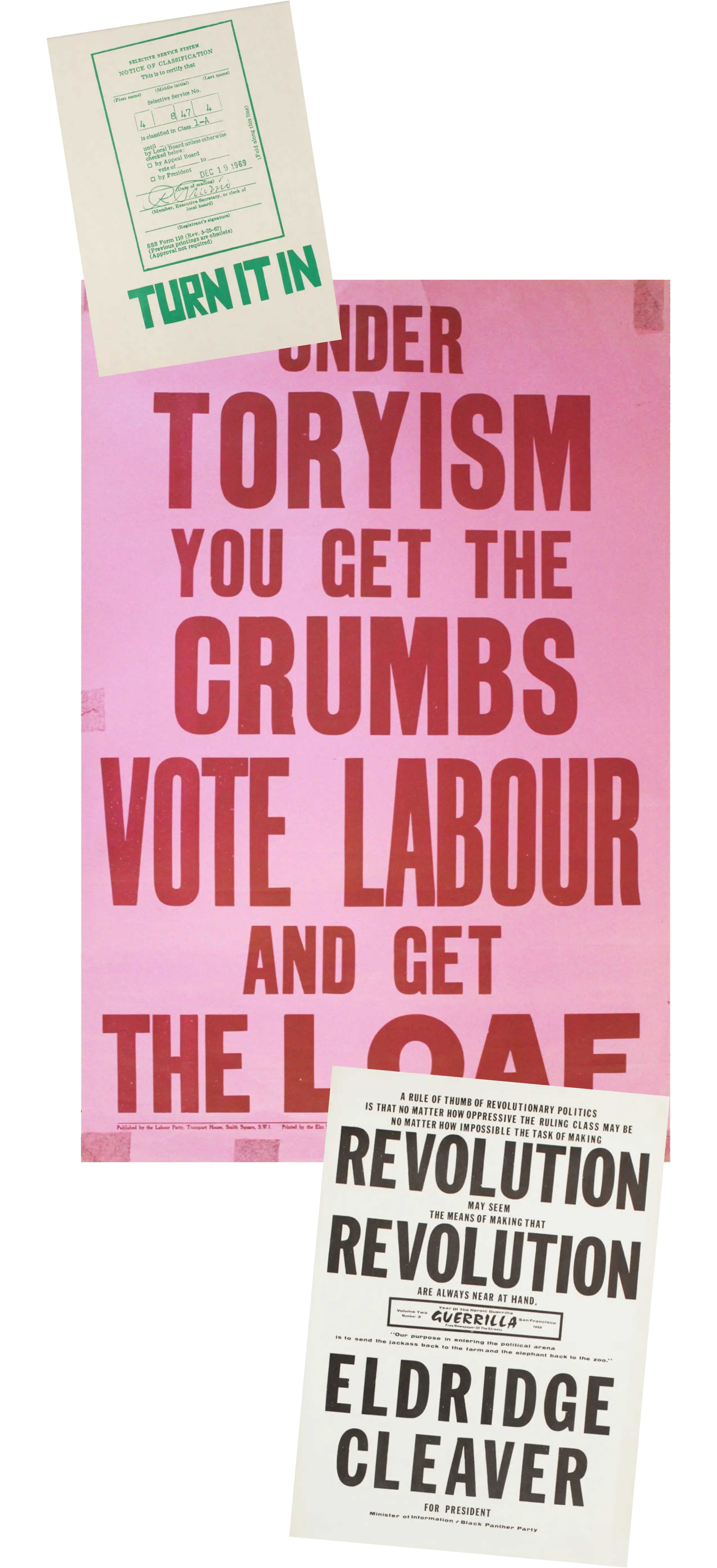
1. Unknown. Turn It In, 1970. Screenprint on computer paper. Collection of Merrill C. Berman. Berkeley, California.
2. 1935 Labour Party. "Under Toryism You Get the Crumbs. Vote Labour and Get the Loaf!" 1935. Poster.
3. Unknown.Revolution (Eldridge Cleaver for President), 1968. Screenprint on paper. Collection of Merrill C. Berman. San Francisco, California.
visual direction
Bold, Direct, and Without Frills.
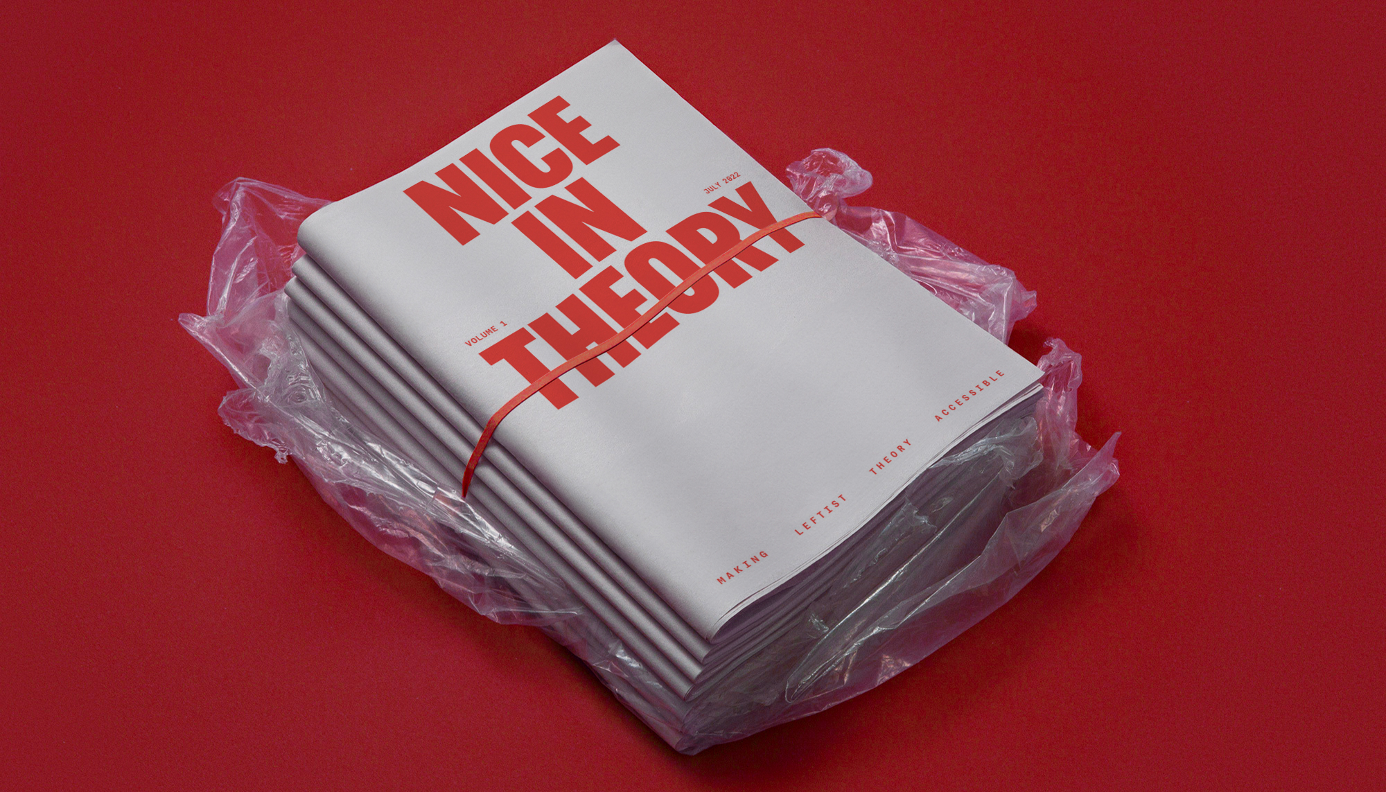
For Nice in Theory, these visual motifs were applied to create a bold, utilitarian aesthetic that emphasizes accessibility and impact. Heavy, uppercase typography commands attention, drawing on the visual language of radical print movements, while a stripped-down red palette keeps production economical without sacrificing urgency. The layout balances clarity with a raw, DIY sensibility, reinforcing the zine’s grassroots identity.

.jpg)